R Tutorials | Descriptive Statistics with R | #rstats
https://global-fintech.blogspot.com/2015/12/descriptive-statistics-with-r.html
#rstats
What is Descriptive Statistics?
Descriptive statistics represent numbers that summarise certain characteristics about a given dataset (a population). They help us to get information based on a certain sample (subset of the population) in order to answer certain questions about various phenomena. In descriptive statistics we operate with the following measures in a data set:
- measures of location (alternatively, measures of center, for they show us where the center is): the mean, the mode, the quartiles and the median
- measures of variability which reflect the dispersion - the relative standing of a particular value within the data: the variance and the standard deviation as well as the range and the interquartile range
- measures of shape which reflect the shape of the data: the skewness and the kurtosis.
R Tutorials | Why Use R for Descriptive Statistics?
 |
| Using R for Descriptive Statistics |
R is a powerful tool to work with all sorts of statistics operations. It is free, quick and efficient and has a lot of libraries for data analysis and statistical computing. Also for the needs of descriptive statistics. You can work both from the R command line or use RStudio - an IDE for R. For our R tutorials, we shall use RStudio.
Descriptive Statistics with R
Scales of Measurement: Types of Data in Statistics
There are two main types of data: categorical (or qualitative) data and numerical (or quantitative) data. Categorical data (categorical variables) record qualities and characteristics of the individual observation. They have no numerical meaning, but categorical variables are numerically coded for convenience and can be summarised by means of the number/percentage (frequency) of observation in a sample. In R, we can declare a variable to be qualitative/categorical/nominal in the following way by means of the function factor():
In contrast to the categorical data, numerical data (categorical data) represent actual numbers (e.g. time and age mesurements or counts). They can be measured on ordinal (ordering or quasi-ranking e.g. for sports competitions), interval (an equal-interval ordering with no zero point e.g. for temperature) and ratio scale (an equal-interval ordering with a zero point e.g. for price). Numerical variables (categorical variables) are subject to statistical math operations to find the location, variability and the shape of the data. To assign a variable as ordinal we need to use the function factor():
We use contingency tables to display the distribution of the variables. Contingency tables give a researcher a clear picture of interrelation between variables. They can be one- (the function table()) and two-dimensional (function xtabs()):
Frequency (distribution) tables are used to display how often the observations occur. In R we create frequency tables by using the following function table()/sum(table()):
Operations of Basic Descriptive Statistics in R
In R we can do basic statistics manipulations just by entering commands. For example, by entering the command summary() we can receive the so-called five-number-summary dividing the data into four equal sections - the minimum and the maximum values, the 1st and the 3rd quartiles as well as the median (the 2nd quartile) and the mean value. By entering mean(), we can calculate the mean value separately. For the measures of variability - the variance and the standard deviation - we have the following commands correspondingly: var() - displays the covariance matrix of all the variables from mydata file - and sd().
Sometimes in our R tutorials we need special libraries in order to use certain commands. For example, for the skewness and the kurtosis, we need the library argricolae. Having installed that library, we can use the functions skewness() and kurtosis().
Graphs and Visualisation of Descriptive Statistics in R
In statistics we use different wys of visualisation. They are normally referred to as graphs. We can use boxplots, histograms, pie charts, scatterplots etc. to make our statistics more spectacular and easy to follow. In R we can produce different types of visualisation as well as save it in .png or .pdf formats. Let's go through the basic ways of visualisation in R to see how they can be useful for us.
Pie Charts - pie() - in R
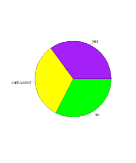
A pie chart takes categorical data and shows the percentage of individuals that fall into each group of the categorical data. The sum of all the slices of the pie equals to 100% . In R, we create a pie chart by using the command pie():
Bar Charts - barplot() - in R
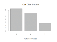
Bar charts is another means for summarising categorical or qualitative data. In the same way as a pie chart, a bar chart breaks data down by groups, showing how many observations lie in each group, or what percentage lies in each group using bars of different heights. We use the function barplot() to create a bar chart:
Histograms - hist() - in R
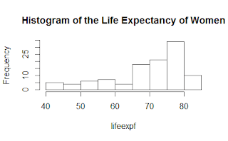 Histograms have a simmilar appearance to that of bar charts. The difference is that they are used for quantitative variables. A histogram provides an overview of all the data broken down into numerically ordered groups. The height of each bar of the histogram represents either the number of individuals in each group (the frequency of each group) or the percentage of individuals in each group (the relative frequency of each group). In R we use the function hist() to create a histogram which we can modify in different ways.
Boxplots - boxplot() - or box-and-whisker plots in R
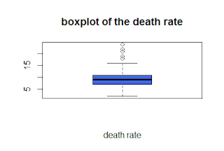
Boxplots are used for quantitative variables. They show us the quartiles with the median in form of a bar in bold and the outliers in form of small cycles beyond and above the whiskers (quartiles). To create a boxplot in R we use the function boxplot(). We can also change the appearance of boxplots in different ways.
Scatterplots - plot() - in R
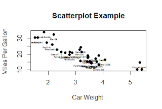
Scatterplots display values for two or three variables from a dataset. On scatterplots, the data are positioned as a collection of points. Each point carries the value of one variable determining its position on the horizontal axis and the value of the other variable responsible for its position on the vertical axis. The function plot() allows us to make a scatterplot in R. We can also add the text subscription to the scatterplot by entering the command text().On the scatterplot, we can also draw lines - lines() - and isolated points - points() - in R:
Now our scatterplot looks like this:
Matrix of all pairs of variables - pairs()
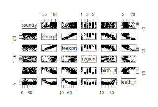 Finally, we can draw a matrix of all possible pairs of variables of a dataset. Such a graph shows the level of interdependence between different pairs of variables. We can do that using the function pairs().
Precision of the Estimation - the Confidence Intervals for the Mean of a Variable
Precision of the Estimation - the Confidence Intervals for the Mean of a Variable
We can draw confidence intervals for the mean of a variable in different groups by using the function plotmeans(). That function needs the library gplots.


